
folds of skin and the relationship of fat, muscle and bone in regards to how it affects the appearance of skin.
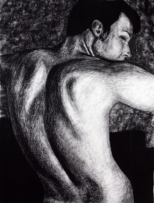
This month, I did Alex's back and my grandfather's face. I've been doing pretty obvious folds - the fat under the boobs, creases where there are joints, etc, so I thought I would develop pieces that showed relationships that were more subtle and relied a little less on fat - aka muscle/bone and sagging old person skin. I also worked on a couple things that I needed more of in my concentration - males (I tripled the amount of males in my concentration!), heads (though now I suppose I should do some female heads), and color (in my gramps).
I feel like the top one is done, and I really like how it turned out. I have never worked with charcoal, except on the rare life drawing, so it took some getting used to, but it was just like prettier, darker, messier graphite.
The bottom one is not done. There isn't really a composition, but I guess I'll leave it like that. I'm not planning on doing any more backround. I need to find myself a detail brush (I couldn't finish it because I was working with a brush that was too big for the glasses and eyes). I need to finish the eye, glasses, and ear, but once I finish them I'll call it done. It looks like him, and I like the colors and some of the shading, but I don't feel as though it is as successful as the first.
3 comments:
The way you shaded the first drawing is really effective. It shows the muscles well, and fits into your concentration perfectly. I know you were concerned about the background before, and I'm not sure what advice to give you. Maybe blend the two spaces so it gradually gets lighter instead of a suddenly line from dark to lighter.
the line quality and the values in alex's one really really work. it's a very epic picture. in the grandpa one it's awesome how you used coffee filters as the background! how creative... overall i like the color usage and grandpa himself looks complete, i feel like what doesn't work is how MOP it is. if he was a little higher or lower or left or right on the canvas it would work better, but i don't know how you can fix that.
For the first time working with charcoal I think you did pretty well! The composition is also pretty great because yeah it's a drawing of his back but at teh same time it holds interest either in how you drew it or just the way he fills the piece. I would agree that it's done..
for the grandpa piece, I think his head needs to be fixed more securely onto his shoulders, that is to say that his shoulders need to be worked a little bit more. the face is great, and the skin along his neck and face looks great, but they look a bit disconnected from his body. i agree that the coffee filters are very creativeee
Post a Comment